Client
Summit Roofing Solutions
Industry
Residential Roofing — DFW
Timeline
2 Weeks
Deliverables
- Fully Responsive, Mobile-Friendly Site
- Inline Hero Lead Capture Form
- Free Drone Estimate Lead Magnet
- On-Site SEO & Structured Data
- Phone & Multi-CTA Conversion Path
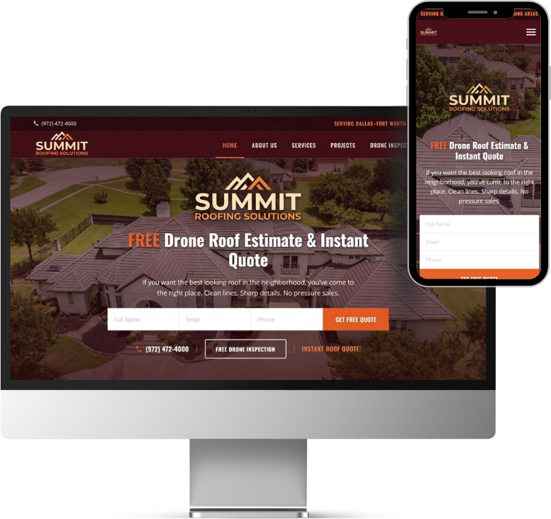
The lead magnet: free drone estimate
Most roofing websites bury their offer behind a generic “Contact Us” page. Summit takes the opposite approach: the very first thing a visitor sees is “FREE Drone Roof Estimate & Instant Quote.” That’s not a passive invitation — it’s a specific, tangible offer that gives the homeowner a reason to engage right now.
A free drone inspection is a strong lead magnet for roofing because it’s valuable (homeowners get a real assessment of their roof without anyone climbing on it), specific (not “free consultation” — a drone flyover and a quote), and low-friction (“no pressure sales” is stated directly in the supporting copy). It lowers the barrier to entry from “I need to commit to a sales call” to “let me just see what my roof looks like from above.”
Inline hero form
The capture form is embedded directly in the hero section — Full Name, Email, Phone, and a bright orange “Get Free Quote” button. No clicking through to a separate page, no hunting for a contact form buried at the bottom.
This design pattern works because it eliminates every step between intent and action. A homeowner who just searched “roofing company near me” and landed on this page can submit their information in under ten seconds without scrolling. Every additional click or page navigation loses a percentage of visitors — the inline form removes all of them.
On mobile, the form stacks vertically and remains above the fold, so the same zero-scroll conversion path holds on phone screens where the majority of local searches happen.
Multi-CTA conversion path
Below the hero form, a secondary CTA bar reinforces three ways to engage: click-to-call the phone number, request a free drone inspection, or get an instant roof quote. This isn’t redundancy — it’s intentional.
Different visitors have different comfort levels. Some want to call. Some prefer to fill out a form. Some want to see more before deciding. By surfacing multiple conversion paths immediately after the hero, the page catches all three segments without requiring them to scroll further.
The phone number is also pinned to the top navigation bar (“(972) 472-4000”), so it’s visible on every scroll position. For roofing — where a meaningful percentage of leads come in as phone calls — persistent phone visibility can be the difference between a call and a bounce.
Site architecture
The navigation includes a dedicated “Drone Inspection” link, which does something smart: it treats the drone offer not just as a hero headline but as a first-class page in the site structure. This lets the drone inspection rank independently in search, gives the topic more depth for SEO, and signals to visitors that this isn’t a throwaway offer — it’s a core service.
The remaining nav structure — Home, About Us, Services, Projects — follows the same local-service-business blueprint that works across trades: establish who you are, show what you do, prove you’ve done it, and make it easy to reach out.
Visual design and photography
The hero uses an aerial drone photograph of a residential neighborhood, which reinforces the drone-inspection theme while showing real houses and real roofs. It’s not a stock photo of a shingle — it’s the kind of image this company would actually capture during a job, which builds authenticity.
The dark burgundy and orange color palette stands out from the typical blue-and-white roofing template. Orange specifically draws the eye to CTAs (the “Get Free Quote” button and the “Instant Roof Quote!” link), while the darker tones give the brand a premium feel that separates Summit from budget competitors.
Why this approach works
Everything about this page is designed to compress the distance between landing and converting. The offer is specific and valuable (free drone estimate). The form is right there (no navigation required). The phone number is always visible (for callers). The secondary CTAs catch anyone who scrolls past the form. And the supporting copy defuses objections before they form (“no pressure sales”).
For a local roofing company competing for DFW homeowners, this kind of tight, offer-led page structure is built to outperform a generic brochure site where the contact page is three clicks deep.